Understanding the Anatomy of Type: Mastering the Details of Letter Design

What Is the Anatomy of Type?
The anatomy of type refers to the structural elements that make up letterforms. Understanding these components is crucial for designers to choose, combine, and arrange letters aesthetically and functionally.
Let’s break down the essential parts of type anatomy in detail!
1. Baseline & Cap Height
- Baseline: The imaginary line on which letters sit. This is the reference line for all characters in a text line. Letters like 'a', 'e', and 'm' rest on the baseline, while characters like 'g' or 'p' extend below it with their descenders.
- Cap Height: The height of uppercase letters from the baseline to the top. For example, letters like 'H' or 'E' reach the cap height. Maintaining a consistent cap height ensures the text looks balanced, especially when combining fonts of different sizes.

2. Ascender & Descender
- Ascender: The part of a letter that rises above the x-height, like the stem on letters ‘b’, ‘d’, or ‘l’. Long ascenders can affect readability if the line spacing is too tight, so it's important to adjust this proportion carefully.
- Descender: The part of a letter that drops below the baseline, like the tail on letters ‘g’, ‘j’, or ‘y’. Providing enough space for descenders prevents overlapping with text lines below, keeping the layout clean and readable.

3. X-Height & Counter
- X-Height: The height of lowercase letters, measured from the baseline to the top of the lowercase 'x'. X-height impacts legibility, especially in smaller font sizes. Fonts with a higher x-height tend to be more readable for long texts, while a lower x-height gives a more classic and elegant feel.
- Counter: The enclosed space within a letter, like in ‘o’, ‘p’, or ‘d’. There are two types of counters: open counter(open space, like in ‘c’) and closed counter (fully enclosed, like in ‘o’). Managing counter size is crucial for maintaining visual balance and avoiding overly dense or loose text.

4. Stem, Stroke & Spine
- Stem: The main vertical line in a letter, like the main body of ‘T’ or ‘L’. The stem is a critical structural element that provides visual weight and stability to the letterform.
- Stroke: The line that shapes a letter, which can be straight, curved, or diagonal. For example, the diagonal line in the letter ‘N’. Stroke thickness affects font weight (light, regular, bold) and dramatically impacts the overall visual impression.
- Spine: The main curve in the letter ‘S’. A more curved spine gives a softer feel, while a rigid spine offers a modern and bold appearance.

5. Serif & Terminal
- Serif: Small lines or strokes attached to the ends of a letter’s main strokes, giving a classic and elegant look. There are different types of serifs, like Bracketed Serif (soft curves) and Slab Serif (thick, block-like). Serif fonts are often used for long texts because they guide the reader’s eye smoothly.
- Terminal: The end of a stroke that doesn’t have a serif, as seen in sans-serif fonts. Terminals can be round, sharp, or flat, often used in modern and minimalist designs.

6. Ligature & Kerning
- Ligature: A combination of two or more letters joined into a single character to avoid awkward visual clashes, like ‘fi’ or ‘fl’. Ligatures help smooth out transitions between letters, enhancing typographic flow.
- Kerning: The adjustment of space between individual letters to create visual harmony. Poor kerning can make text hard to read or look unpolished. Manual kerning is often necessary for logos or titles to ensure perfect balance.

Why Understanding the Anatomy of Type Matters
Mastering letter anatomy helps you create more balanced, readable, and visually pleasing designs. It also empowers you to experiment with custom fonts, find ideal font pairings, and craft unique logos.
For example, knowing how to handle ascenders and descenders prevents line overlaps, while understanding counters helps you choose fonts that remain legible even at small sizes.
Looking for Fonts with Perfect Anatomy? Explore Our Collection!
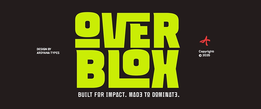
At Ardyana Types, we design fonts with meticulous attention to every typographic detail. From elegant serifs to playful scripts, every font is crafted to be easy to arrange and suitable for various design needs.
🔗 Browse the Ardyana Types Font Collection
🚀 Elevate your design game and choose fonts that strengthen your brand's visual identity or creative projects!


0 comments